Chinatown: A Perfect Movie Poster
- Alex Swart
- Oct 7, 2021
- 9 min read
Updated: Mar 18, 2025
I first saw the Chinatown poster in a display case at our small town movie house, ambitiously named The Ritz. Once inside the darkened theater, the movie had me transfixed—from the aching trumpet notes by Jerry Goldsmith that open the film, to its devastating conclusion. I'm going to write about the poster that motivated me to enter that theater and the artist who created it, but first let’s consider the film it advertised.
Why the Movie Matters
Chinatown is significant within its genre because unlike other neo-noirs, such as Body Heat, 1981—which was inspired by the seminal noir Double Indemnity, 1944—it is wholly original. Chinatown upends many hardboiled tropes, while ostensibly operating within formulaic conventions. Spoiler alert—if you’ve not yet seen the movie, you may want to stop reading now! In Robert Towne’s Oscar-winning original screenplay, the detective hero Jake Gittes, portrayed by Jack Nicholson, is the kind of protagonist who usually prevails in noir as judge, jury, and sometimes executioner. But in Chinatown he is ultimately left powerless by the wealthy and criminal elements—one and the same in John Huston’s portrayal of Noah Cross. In my view, this unholy collusion is evidence of a European pessimism that underlies director Roman Polanski’s most American film—a darkness filtered through Polanski’s childhood Holocaust trauma and reinforced by the infamous murder of his pregnant spouse Sharon Tate (Polanski reshaped aspects of Towne's script). In another turnabout, all the actions of the assumed femme fatale Evelyn Mulwray, played by Faye Dunaway, are actually motivated by a selfless love. Thus, Towne subverts a misogynistic convention dating back to the Biblical story of Eve in the Garden of Eden.
The casting and performances are impeccable. Nicholson’s tough veneer contrasts perfectly with Dunaway’s haughty fragility. Huston projects the self-assured malevolence of the powerful. And the film looks perfect too. John P. Alonzo’s sun-bleached cinematography preserves Richard Sylbert’s color-coded production design consisting of beiges and browns for an arid depiction of Los Angeles—only wealthy clients and well-heeled suspects enjoy cool drinks amid velvet green lawns. Anthea Sylbert’s costume design deftly supports this color scheme; the sharply tailored suits worn by Nicholson’s working detective are beige as well. Crisp white clothing is reserved for the idle swells who can afford frequent dry cleaning.
There are some off-notes. The title sets up an expectation, but the movie takes place in its namesake location for only a few minutes. Asian actors appear all too briefly: Jerry Fujikawa as the Gardener who retrieves a literally submerged clue, and James Hong as Khan the Butler. I’m left wanting to know more about Khan, who goes beyond his job description to protect Faye Dunaway’s vulnerable character from the forces of wickedness.
Cultural Judgment vs. Criminal Indictment
Chinatown is universally held in high regard. According to Wikipedia: In 1991, the film was selected by the Library of Congress for preservation in the United States National Film Registry as being "culturally, historically or aesthetically significant" …and it is frequently listed as one of the greatest films of all time… At the 47th Academy Awards, it was nominated for 11 Oscars, with Towne winning Best Original Screenplay. The Golden Globe Awards honored it for Best Drama, Best Director, Best Actor, and Best Screenplay. The American Film Institute placed it second among its top ten mystery films in 2008.
Watching Chinatown again, I appreciated how its conclusion is foreshadowed earlier in the story. However, so is an actual crime that occurred in 1977. Roman Polanski pleaded guilty in a Los Angeles court to unlawful sex with a minor but eluded punishment by fleeing to Europe.
When my son recently recommended the movie to a colleague, she said she couldn’t watch the film because of its director. That principled stance begs a question; do you redact the art because of the sins of the artist? Tristan und Isolde remains an operatic milestone despite Richard Wagner’s virulent anti-semitism. Notwithstanding that comedian Hannah Goldsby calls Pablo Picasso’s work “Pablo-matic” misogyny, Guernica still serves as a searing indictment against war. It may help to remember that Chinatown—like most other cinematic masterpieces—is a collaborative artwork by a brilliant team of blameless creative people.
The Perfect Poster
A studio marketing executive once said to me, “Most movies are crap. At least we can make a good movie poster.” Chinatown is one instance where the advertising key art is as great as the film. Chinatown is a perfect movie poster. Really? “That’s just, like, your opinion, man,” you might reply in the words of the eponymous protagonist—a.k.a. The Dude—in the neo-noir send-up The Big Lebowski. Maybe it’s because I first saw it at an impressionable age. I’ve dropped the needle on music that was important to me back in the day, but it doesn’t sound as good now. I like to think I look at the Chinatown poster from a professional perspective. I made art in college, studied Film and TV in grad school, and merged those interests throughout my subsequent career. I’ve designed Oscar posters, legacy television campaigns, and movie posters (before these mediums were subsumed by streaming platforms). Critical analysis is the foundation of the entertainment advertising design classes that I’ve taught at two universities. And so while I sometimes resort to objective language—that is the language of authority—the Dude’ has a point.
Symbolism and Montage
Perfection is big claim. The Chinatown poster lacks the ne plus ultra that creative directors prize: a symbolic concept. Concept key art usually consists of juxtaposition that is a blending of two or more elements that usually don’t go together. As exemplified in the key art for The Godfather, 1972, the title treatment is turned into a string puppet (derived from a typographical concept initially designed by Neil Fujita for Mario Puzo’s best-selling 1969 novel). Like the film itself, the poster for the sequel, The Godfather Part II, 1974, reprises the themes of its predecessor. Incidentally, the crime film inexplicably (to me) beat out Chinatown for the Best Picture Oscar.
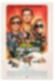
Another way to sell movies is with story montages—painted or photo-composites—populated by people and objects organized with contrasting scale relationships and varied settings. The Once Upon a Time in Hollywood poster, 2019 (illustrated by Steve Chorney, design by BLT Communications), is an excellent example of telling an LA-centric story through poster montage. The movie it represents tells a fantasy version of Sharon Tate’s story, so in a six degrees of separation kind of way, it is connected to Roman Polanski’s Chinatown.
Line and Form
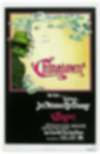
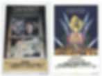
The complex plot of Chinatown could be unwieldy to depict in an advertising poster. The Chinatown poster doesn’t try. It doesn’t convey the breadth of the story. Nor does the Chinatown poster get attention with a symbolic idea. Rather, a few elements are drawn by hand—with flowing lines that are both strong and delicate—to represent the relationship propelling the film. We can see the profile of a man. He wears a chalk-stripe suit and a fedora with the high crown popular in the 1930s—part of the uniform of any self-respecting private detective of the time. The brim of the hat casts shadow on this face. Smoke emanating from his unfiltered cigarette swirls upward.
The smoke morphs into hair—okay, that’s kind of a juxtaposition. The “hair” frames a famous face—actually just lips, a nose, and sultry eyes with arched, penciled eyebrows indicative of Depression Era fashion. She haunts him, as she
will haunt the audience after the movie ends. These excellent likenesses of Faye Dunaway and Jack Nicholson are drawn with alternating heavy and delicate lines—which at first glance seems reminiscent of pioneering French poster artist Alphonse Mucha. Perhaps it was inspired by Art Nouveau. But the loopy, outlined smoke/hair always reminded me of an old bronze, enameled Chinese vase my father picked up at an Amsterdam flea market. I like to think the curved lines represent Khan.

The Color of Mystery
Movie posters for crime films today are often de-saturated, bled of color. Whereas Chinatown’s almost lurid combination of green, gold, and magenta seems slightly off, indicating that all is not well. Within the lines, the palette is vivid. Contained inside a square magenta inner frame floating on a black outer background, Dunaway’s features emerge out of a pale harvest gold background, redolent of the movie’s semi-arid Los Angeles setting. The behatted man is tinted dark green (a reflection of a client's lawn, or money?).
A diminutive wave, also pale green, in the style of Hokusai’s woodcut The Great Wave off Kanawaga, peeks above the bottom of the magenta enclosure. It represents another relationship—that of Los Angeles with water. Chinatown is about getting—or rather, stealing—water for a thirsty city. With drought an existential reality in the Western United States, the film is especially relevant.
Artistry and Composition
There’s a belief that drawn or painted posters are better than photo-executed ones. Others think illustration is a sentimental approach. I’m agnostic; photography is often the right choice. Mastery of a medium—whether photographic, digital, or painted—is actually what makes an artwork, well, work. Chinatown’s impact is a result of drawing fluency, confident artistic choices, and striking color. It is mysteriously visual without any ad copy to explain its premise, only a hand-lettered calligraphic title treatment.
Compare the idiosyncratic Chinatown key art to two posters which reconstitute a scene from their respective movies (albeit with the perspective-violating additions of a floating head). The first is a story sell illustrated by David McMacken for Farewell, My Lovely, 1975 (a film based on the Raymond Chandler novel of the same name). Similar elements are deployed—a male detective with fedora and cigarette, the face of a beautiful woman, lots of smoke, as well as a neon title treatment and a hardboiled quote from the film. But unlike Chinatown, the poster feels like something we’ve seen before. Perhaps that was the artist’s intention—Farewell, My Lovely (a remake of Murder, My Sweet, 1944) is a nostalgic mystery that upholds all the conventions of classic noir.
The poster for The Day of the Locust, 1975—illustrated by David Edward Byrd (renowned rock and Broadway poster artist)—a concurrent Paramount production set in the same city as Chinatown and the same 1930s time period, and even sharing the same yellow Packard convertible—also recalls a movie scene; it illustrates the film's violent climax. Symmetry, which is often deployed in design to project power and authority, is utilized here to depict a populist mob uprising. Conversely, the pencil drawing that underlies the Chinatown key art balances its elements in an asymmetrical composition. This off-centering is appropriate because the protagonists are inadvertently attempting to defy Los Angeles’ corrupt social order.
The Artist
In 1992, I was hired as Executive Art Director at Jacobs & Gerber, an L.A. advertising agency specializing in television promotion. I was delighted to meet one of my new colleagues, Jim Pearsall, a thin, silver-haired man with a shy smile. Jim had come to the West Coast from New York City where he had designed Broadway show posters. Jim had also created the Chinatown poster! He chuckled when I told him that his key art had inspired me, so my choice of career was all his fault. I enjoyed working with Jim and would often prompt him to tell stories about Hollywood’s late Golden Age. He’d talk about working with Saul Bass on the West Side Story poster, and partying with Ava Gardner in Spain. Of course, I’d also ask about Chinatown.

In his excellent book, The Big Goodbye: Chinatown and the Last Years of Hollywood, Sam Wasson describes how producer and Paramount Pictures studio chief Robert Evans hosted an ongoing, cocaine-fueled—or whatever your pleasure—party at Woodland, his opulent Regency-style Shangri-La in Beverly Hills. Away from the studio, and even further from its owner, Gulf and Western Industries (headquartered in New York), Evans kept Woodland free of corporate interference. Woodland was a safe space for creatives where director Roman Polanski, Towne, the Sylberts, and Evans could visualize the movie on their own terms.
In our workplace conversations Jim pre-corroborated Wasson’s account of the film’s development—he was also there at Woodland working on the poster. Instead of coke, Evans kept Jim motivated with his preferred diet of greyhounds (a potent mixture of vodka and grapefruit juice). Although ostensibly employed at Diener Hauser Bates Advertising, Jim worked independently on the poster. His initials—JP—placed in the lower-right corner of the gold background attest to his creative autonomy.
A Promise
The day after I announced my departure from J&G, Jim gave me his personal, framed copy of the Chinatown poster. There was an ever-present Virginia Slims cigarette nestled between his long fingers. I had a glancing concern about his health—it seemed like Jim was also moving on.
A year later J&G’s account executive, Paul Roome, called to say Jim Pearsall was dying and wanted to say goodbye. Friends were already gathered as I arrived at his West Hollywood apartment. When it was my turn at his bedside. Jim exclaimed with a rueful smile, “Stomach cancer! Can you believe it? I thought it would be my lungs.” Not knowing quite how to respond, I said I’d let everyone know that he had created the Chinatown poster. Jim patted my hand indulgently. To paraphrase Chandler, he was past caring about things like that.
©2020 Alex Swart • All rights reserved