
How TV Taught Me To Win

Updated: 10 hours ago
“Creating something large is easy. Creating something small is hard.”
— Gronk, the artist (in conversation with Paul Holdengräber at Caltech, August. 22, 2026)

I had landed a dream job as an art director designing movie posters at the legendary Hollywood agency Seiniger Advertising. But after six months working there, I was sitting across the desk of the company’s namesake. Tony Seiniger fired me with line that could have been lifted from a coming-of-age movie: “Kid, it’s not that you’re not talented. You’re just too slow.”
It was a gut punch. The movie poster still resided at the top of the print advertising pantheon. Also known as key art, these spacious ads distill the premise and the promise of a two-hour film into a single image. Their relatively large canvas of 27" × 40" gives an artist or designer the space to attract audiences with maximalist bombast or minimalist elegance—whatever approach works best for a particular story. Now I was out of the game.
That sacking may have been the best thing that happened to my career. Afterwards, I tried to work harder on the temporary gigs that came my way. I was still languishing on my girlfriend Ellen’s couch, nursing my bruised ego, when she mentioned an article she had read in the Los Angeles Times.: “Scott Mednick & Associates just landed the CBS account. They’ll be looking for art directors. I think you’d be very good in television.” Listening to Ellen was the other best thing.
But how was I to break into TV? Back then, everyone sent résumés. I knew my own chronological list of accomplishments and employers would just get lost in the deluge. However, I’d been reading the seminal book Ogilvy on Advertising. Instead of sending a résumé, I was inspired to write and design an ad following David Ogilvy’s principles—with the product name (my own) embedded in the headline, along with a consumer (or rather, agency) benefit that immodestly extolled my virtues in each short body copy paragraph. I had it printed, put it in an envelope cheekily rubber-stamped "PRIORITY," and snail-mailed it to SM&A (email wasn’t yet a thing).

The "ad" must have stood out amidst the 800+ résumés SM&A received, because I was promptly called in for an interview at the old brick storefront on Beverly Blvd. that housed the agency. I like to imagine the thrust and parry of interview questions and answers as a kind of benign lightsaber duel, replete with the requisite hum and buzz sounds. It helps me enjoy the process. After a preliminary back-and-forth with the Account Director, I met the founder, Scott Mednick. With long dark hair, a trim beard, and dressed in all black, Scott had a preternatural confidence that belied his youthful demeanor. His surety was contagious—especially when he concluded the meeting by hiring me. This was going to be a great summer!
The TV unit was housed in an adjacent storefront, an annex known as Mednick East. A week later, I joined the other members of the new team. Someone asked Scott what we should call him: Creative Director? Founder? President? He replied with a mischievous smile, “Just call me ‘O Captain! My Captain!’”
I was introduced to Dana, a young blonde woman wearing a black leather motorcycle jacket, who was our Associate Creative Director and Head Writer. She was an edgy contrast to Tom, our Armani-attired Associate Account Executive. Donn, our urbane Associate Creative Director/Art, added years of national magazine design at Playboy to the mix. Copywriters included Dani, Myles, and occasionally Peter (borrowed from Mednick’s consumer side), as well as Robert, who came aboard a few months later. I joined three art directors: Nancy, Jack, and Allan. My friend Jim subsequently filled out the AD group. Jay, a Senior Art Director with years of experience at CBS, would advise us TV newbies as needed. Another Jack, the production manager, was an industry veteran who had created the Gilda film noir poster in the 1940s. Along with Kitty (the resource coordinator), assistant AEs, junior designers, production artists, typesetters and retouchers, we became an agency within an agency.

The four of us art directors, along with the writers, were charged with creating a new CBS Fall ’89 primetime tune-in campaign. Thematically, our proposed campaigns had to accommodate many genres while maintaining a coherent look for the network. Featured shows included the dramatic series Dallas and Wiseguy, alongside hit comedies such as Murphy Brown and Newhart. Broadcast television was the preeminent medium of the era. Primetime referred to the hours between 8:00 p.m. and 11:00 p.m., when the three major networks (CBS, NBC, and ABC) dominated programming across their 250+ local affiliate stations. The primary advertising platform was TV Guide, a weekly magazine whose broadcast and cable listings—and related advertisements—influenced the viewing choices of its 52 million readers.
I would be competing with my three art director colleagues, whose graphic design chops were formidable. Nancy’s serene manner belied a lively aesthetic; her design motifs jumped off the page. Allan orchestrated typography and visuals within a limited space without crowding either element—a crucial skill when designing for TV Guide’s compact layout (5" × 7.375"). And wry, Sphinx-like Jack could do it all. I had to try a different approach.

Now, my idea of a perfect vacation was lounging poolside under palm trees with a pile of magazines. I always studied the product ads that bracketed the articles; the best of them were concise, conceptual, and persuasive. One even convinced me to buy a new Honda! Those Madison Avenue–style ads also inspired my CBS campaign.
That classic, headline-driven paradigm wasn’t the norm in entertainment—certainly not the way episodic programming was usually promoted on the pages of TV Guide. Nonetheless, I devised a design hierarchy utilizing bold headlines and visuals with a strong contrast of scale. Tackling that small ad format presented a different kind of compositional challenge than the more spacious movie poster. Dynamic tonal range was also a concern; TV Guide ads could only be printed in grayscale, without the added pop of color. I didn’t develop the campaign alone: Peter co-wrote the headlines, Ellen suggested soft edges for the image insets, and Donn recommended having the foreground figures break through those edges.
One afternoon, the account team went to CBS to present our four campaign proposals. Assembled in the annex, the rest of the staff—especially we art directors—were anxiously awaiting the client’s decision when, backlit by the late afternoon sun, Scott Mednick strode through the front door. You could have cut the stillness in the air with a knife. Scott softly announced, “We sold a campaign. Alex’s campaign.” After a dramatic pause, he added, “Now it’s our campaign.” He popped the cork off a bottle of champagne, took a swig, and handed it to me: “You get the game ball!” It was a masterclass in congratulating someone while demonstrating how to reframe individual disappointment into a victory for the agency. Maybe I do have a future in this business.
So, we began creating the campaign materials for the episodic dramas and comedies on the CBS slate. It was exciting to plan and direct photo shoots of stars and casts on location in Vancouver, as well as just down the street at CBS Television City. But I still had a lot to learn. When I asked Bob Newhart to embrace his glamorous TV wife, Mary Frann, during a photo setup for the hit comedy series Newhart, Mary said, “He doesn’t do that. How long have you been on the job? Five minutes?” She wasn’t wrong. Lesson learned: do your research.
Back at the agency, we settled in and designed ads. All the writers and art directors adapted the new format to their assigned shows. Art directors were given a selection of shows and a week to create ads for them, while production artists assisted with execution—a time-consuming process in those pre-Photoshop days. Television advertising moved at a much faster pace than the movie business. My prolific colleagues seemed to enjoy working late in crisis mode, thriving on last-minute pressure the night before projects were due. As a morning person, I despised pulling all-nighters.
The old refrain kept playing in my head: “Too slow. Too slow. TOO SLOW!” I decided to become THE FASTEST ART DIRECTOR IN THE WORLD! To do that, I moved the goalposts—that is, rearranged the sequence of work. I dubbed it “Having Your Crisis Upfront.” That means concocting a sense of urgency at the onset of a project, not the night before the deadline. Said differently: focus on getting the one thing done that makes everything else possible. I’ve since shared this process with my CSUN students, and it may work for you:
Monday: Attack the new assignments with urgency. Commence research and ideation. Rapidly follow with thumbnail sketches of concepts while playing with the words.
Tuesday: Experiment with composition and build comps (facsimiles of proposed ads).
Wednesday: Relax in the momentum achieved in the first two days and maintain a calm state of mind to clearly evaluate the work. The great part of starting early is that one’s subconscious mind continues to work on the assignments while doing other things. Or sleeping. The luxury of time allows space to adjust the compositions and tweak copy as needed.
Thursday: Execute refinements. Visualize the in-house presentation. Go home on time and enjoy the evening.
Friday: Present the work with confidence.
And if you only have a day, compress these steps into short intervals. The main thing is not to procrastinate.

To complement my new process (and new mustache), I invented a persona radically different from my actual self: tall (okay, that came naturally), quiet, and speaking only when necessary. For example, one afternoon Dana and Tom stopped by my workstation, hopeful expressions on their faces, “CBS just dropped a new show into the schedule! We’ve gotta show them a new ad in three hours!” Panic constricted my response to a low, raspy whisper, “No problem.” I immediately saw relief in their eyes—they believed I could actually pull it off. And so, I did. My takeaway: along with having your crisis upfront, talk like Clint Eastwood.
Our new campaign dominated the Fall Premiere edition of TV Guide (September 16–22, 1989). The purpose of the campaign was to attract audiences—in TV parlance, to drive tune-in—and it did. That week, CBS was at the top of the ratings, beating archrivals ABC and NBC. One of those ads was placed on my desk with an encouranging one-word, handwritten note from Scott, “Nice!”

Ad agencies are places where creatives and business people work together—SM&A was no exception. I especially enjoyed ideating and laughing with Robert, a comedy writer who came from the LA radio station KROQ. While I sketched and Robert wrote, he would do the voices of the actors and news anchors we were promoting; it always cracked me up. Conversely, when Tom was heading out to show our comps to the CBS marketing executives, I asked with artistic naïveté, “Which one do you like best?” He schooled me like a true account executive: “I like whatever the client likes.”
About a year later, the agency then known as the New York Yankees of movie advertising called, “We’re looking for a mid-level player who can pitch three innings out of nine.” Concept development and artistic composition came quickly to me during that second stint at Seiniger Advertising. The upfront process provided the time to make the most of creative opportunities there. My minimalist design for the Hook teaser poster (with photography by Nels Israelson and color enhancement by John Alvin) makes it one of the few movie posters without words.
Eventually, Ellen and I were married, and in 1996 we launched our agency, SwârtAd. In an age of AI, our company ethos still stresses the importance of originality. One of our first ads proclaimed that strategic imperative from the cover of Daily Variety: “An Original Always Stands Out.” Hence, we always foreground HI—our Human Intelligence—to make strategic use of emerging technological applications.

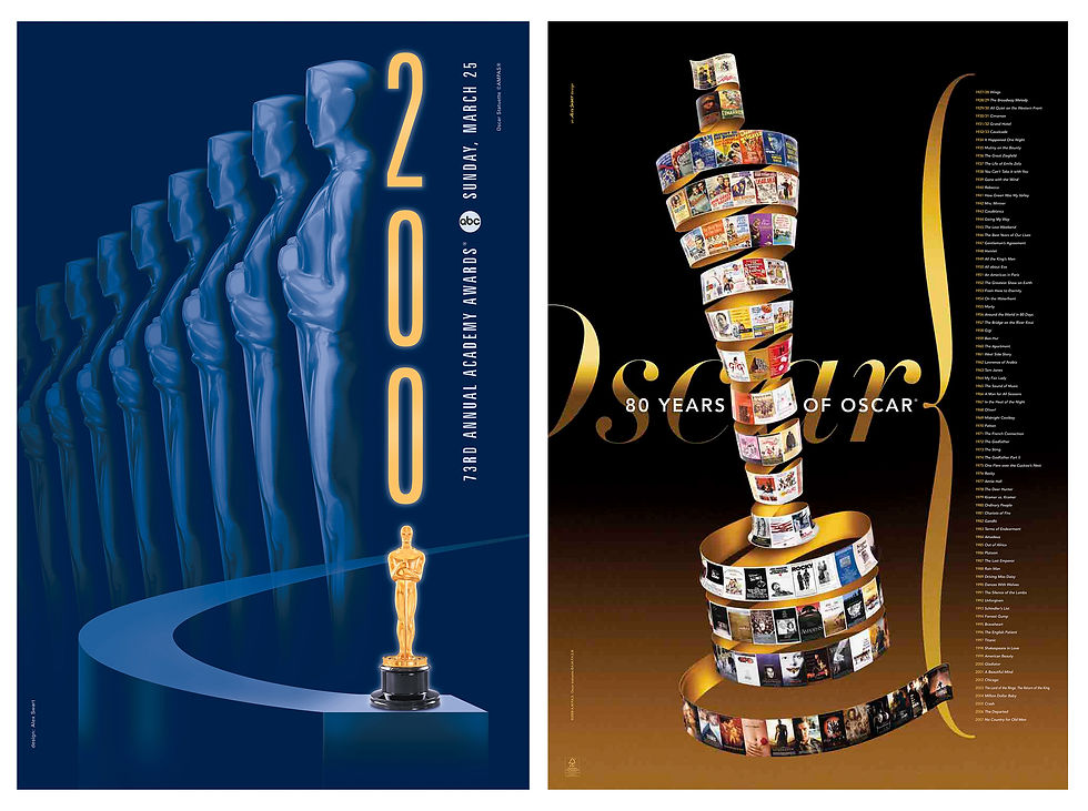
Our work continues to toggle between movie and television advertising. During thirty years in business, we've conceived network news campaigns, created key art for indie films, and designed a record number of Oscar® posters, with press coverage and awards following. We've also worked on scores of episodic television campaigns, such as Star Trek: Deep Space Nine. Those kinds of projects have always started with a feeling of confidence, because TV taught me how to win.


Comments